Point by Point Dashboards Advanced
Now that you've seen how to use the Overview dashboard, let's dive in a bit deeper on a more complex dashboard. We'll be using the Indicators vs. Budget dashboard on the Global Education Strategy for the rest of this chapter. You should have a screen that looks like this:
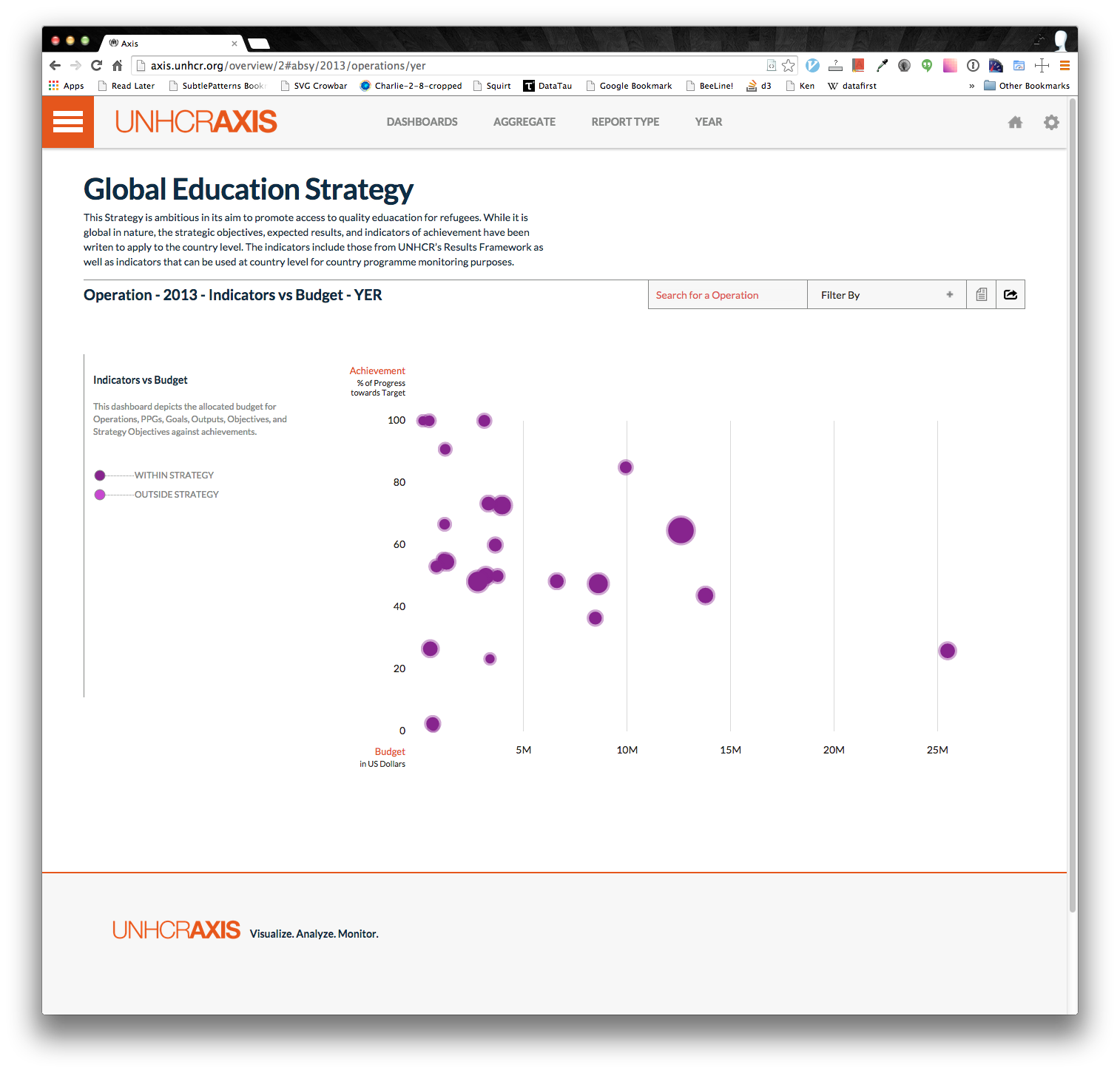
Notice how you can hover over each data point and get more information on what you are seeing:
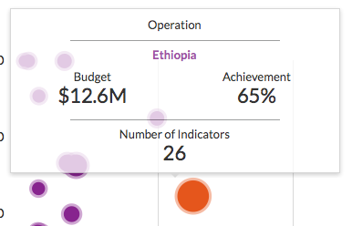
You can see the budget (the x-axis), the achievement (the y-axis) and the number of indicators selected (size of the bubble). To know exactly how the budget and achievement are calculated simply open up the filters dropdown where you should see something like this:
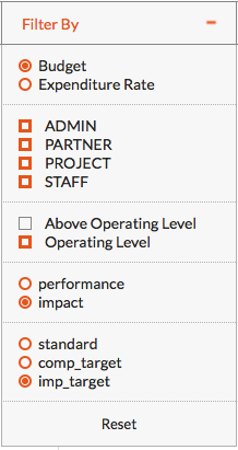
Here you can see that the Budget algorithm was selected and that all components are checked on. The AOL is by default checked off. And you can see you're looking at impact indicators measured towards the impact target. Go ahead and try changing some of the filters and you will see the graph automatically update.
OK, that's all well and good, but there are quite a lot of circles on that chart. What I wanted to find the Ethiopia bubble? You could mouse over each bubble and find the one that says Ethiopia, or you could search for it in the search box next to the filters:
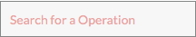
Try typing 'eth' into the search box. You will see any circle matching that query turn green.
Not too bad. But let's get a bit more fancy. Look towards the top of the screen and you should see a menu bar in either one of these two forms:


Don't be frightened by the two headers, they are designed to aid you. They are essentially the same thing. The second one appears when you scroll past the name of strategy. The second menu bar is a bit more condensed, but allows you to still know that you are looking at the Global Education Strategy in 2013 on the Indicators vs. Budget dashboard, using the YER and aggregated by Operation without having to scroll up to the top of the page every time.
Click on either AGGREGATE or Operation depending on which menu bar you are looking at. This will open a list of options: Operation, PPG, Goal, Objective, Output, Strategy Objective. By choosing PPG, you will notice that the circle on the graph are all now all PPGs. This provides an easy way to find the budget of a specific PPG. The reason this option is present at the top of the page is that it applies to all the dashboards (except the Map). Go ahead and flip to some other dashboards and notice how the aggregation is done by PPG.
Navigate back to the Indicators vs Budget dashboard. Try clicking on the REPORT TYPE on the menu bar. See how the circles move when you toggle between Mid Year and Year End. Do the same for the YEAR. If you click 2015 (or 2014) depending on the date you are reading this, all the circles will fall to the bottom since none of the indicator values have been recorded yet.
Great. Now you can really manipulate a dashboard. There's still more you can do! But we'll cover that later.
Next: [Reading Narratives](Point by Point Narratives)
Previous: [Dashboards](Point by Point Dashboards)
Exercises
- What is the OL + AOL budget of RWANDA's PPG Refugees in camps?
- Which Goal has the high achievement toward the standard (impact indicators)?
- Which Operation selected the most impact indicators in 2012?