Closed
Description
We're trying to make a chart with multiple, overlapping candlesticks. The code we're using is this:
    for idx, dataset in enumerate(ohlc_collector):
        ohlc_data = dataset[1]
        apds.append(mpf.make_addplot(ohlc_data, type="candle", secondary_y=False))
        fig, axlist = mpf.plot(ohlc_data, addplot=apds, type="candle", show_nontrading=True,
                               figratio=(10, 5), ylabel="", savefig="Chart_OHLC.pdf", returnfig=True)
Using this code, the end result looks like this:
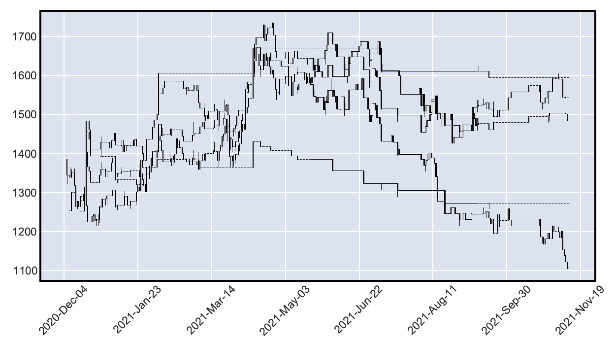
Quite ugly, I know. It will get tidied up and with better resolution it will work out well enough. What we need however, is to color every candlestick data series a SINGLE color (unlike other candlesticks; basically one series red, another one blue, and so on), not unlike a multiline chart.
However, you can't use color= for make_addplot() if type is "candle", and if you apply a style at plot(), it will apply to ALL candlesticks. How could you color each and every candlestick a different color?