Smart Kerning or Textual Healing for Maple Mono #500
Replies: 4 comments 1 reply
-
|
I had never heard of this before, but looking at the links provided, I really like this concept! Particularly Monaspace's implementation, with Texture Healing. But it looks like it'd a pretty hefty amount of work to implement. Monaspace referencing its OpenType implementation in the readme is promising, though... Curious to see what Subframe will think. 🤔 |
Beta Was this translation helpful? Give feedback.
-
|
That is definitely an interesting feature. For me, it might sounds impressive in theory and looks wonderful on website and showcase picture, but when you actually work with large blocks of code in the editor, it just feels off and downright uncomfortable: It disrupts vertical alignment and makes certain parts of words appear overly prominent.
As a result, I have a negative opinion about it. |

Beta Was this translation helpful? Give feedback.
-
|
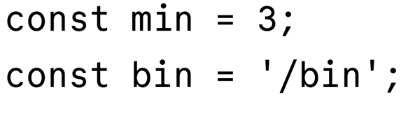
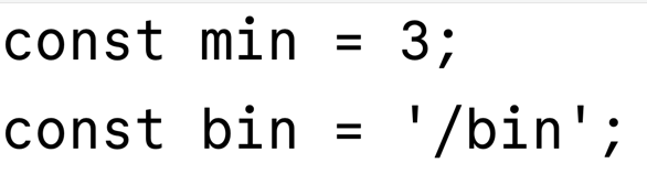
Commit Mono's "smart kerning" is a little more subtle. Letters do not change shape. The vertical alignment is disrupted, in exchange for (arguably) better horizontal readability. Here is a screenshot of Commit Mono with smart kerning on: You can see that vertically the letters do not quite line up, but there is a more even spacing letter by letter as you read line by line. Here is the same text in Commit Mono with smart kerning turned off: The letters vertically align now, but there is some extra space, for example between the "i" and "n" in "min" and "bin". So it's a tradeoff. Andreas Larsen, creator of the Monoid font, describes this approach in this article: Class Based Contextual Positioning in MonoSpaced Fonts. He summarizes the tradeoffs well:
|
Beta Was this translation helpful? Give feedback.
-
|
While I understand and appreciate your perspective, this feature request is subjective and based on personal preference. As a non-native English speaker, I still believe that vertical alignment is a higher priority for me. If you would like to see this functionality, I encourage you to try implementing it yourself by writing some custom kerning rules. Contributions are always welcome! Thanks for your understanding. |
Beta Was this translation helpful? Give feedback.
-
|
Thanks @subframe7536! I totally agree, this is very subjective, and your perspective makes sense. Thanks for making a great font! |
Beta Was this translation helpful? Give feedback.
Uh oh!
There was an error while loading. Please reload this page.
-
Commit Mono has a feature it calls Smart Kerning, which slides characters around a bit to even out the spacing. Notice how the letters slide to make more space for the wide 'm' character as the feature is turned on and off:
I believe Monoid does something similar.
Monaspace has a feature it calls texture healing, which substitutes wider or narrow glyphs depending on context to even things out:
0xProto also implements texture healing.
Some people like these features, others don't. I like it! I think it does make code just a little bit more pleasing to read, and for me at least, it's not distracting when typing (YMMV).
I think it'd be nice to have one of these as an option for Maple Mono.
Beta Was this translation helpful? Give feedback.
All reactions