Releases: primer/figma
@primer/[email protected]
Tokenized shadows
Primer web now comes with shadow styles that use primer primitives (Figma variables). This means they react to changes of the theme, so when you change to any of the new color modes, the shadow will change as well.
Tip
Only elements with Clip content set to true get the outline border in dark modes.

@primer/[email protected]
🎨 New color modes
We are now on Figma enterprise, which allows us to add all 9 color modes.

This means that if you are using primer web components or build your own designs using the primer primitive tokens (Figma variables, NOT styles) you can preview your designs in all 9 color modes.
@primer/brand v1.4.0
Enhancements
- Added a new PricingCards component.
Fixes
- Fixed a layout bug in the ButtonGroup component.

@primer/[email protected]
Update Textarea

The Textarea component was vastly simplified and aligned to the code implementation.
insetproperty was removed in favour of a simplercontrastpropertysizeproperty was removed in alignment with the implementationtext typeproperty was fixed by integrating it into the component rather than nesting, this also makes using it much easier- Label properties were hoisted to be directly available in the component
@primer/brand v1.3.0
Enhancements
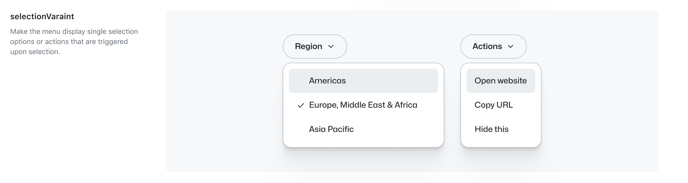
- Added support for settting a
selectionVariantprop in the ActionMenu component. - Added experimental support for variables. IMPORTANT: We're implementing Primitives v8 in Primer Brand, which will impact the currently available.
- Refactored the Card component to a single, simplified variant and use variables across the board.
@primer/web v1.7.0
Updates
-
Updated correct inset shadow in
text inputandtextarea

-
Updated
ButtonandIconButtonto have simpler setup with fewer layers -
Updated components that use
ButtonandIconButtonto use the new version.
@primer/web v1.6.0
Update
Updated structure of Button component, using new design tokens and removing superfluous layers.

@primer/web v1.5.0
Added
-
added loading button

-
added loading iconButton

Update
-
removed the disabled state from the toggle switch

-
added new sub component for action list: loading state for list item

@primer/web v1.4.0
🎉 Added
Skeleton loader component

Added Grid Styles

Updates
CommentBox
- Added border around inner input

@primer/brand v1.2.0
Enhancements
- Added the new EyebrowBanner component.
- Added support for multiple actions in the AnchorNav component
The new EyebrowBanner component

AnchorNav with multiple and single action configurations

Notes
Starting from version 1.2.0 (this version), Primer Brand Figma will adhere to the SemVer convention. New releases will be published on github.com/primer/figma, along with Primer Web, and shared through the usual Slack channels.